Description
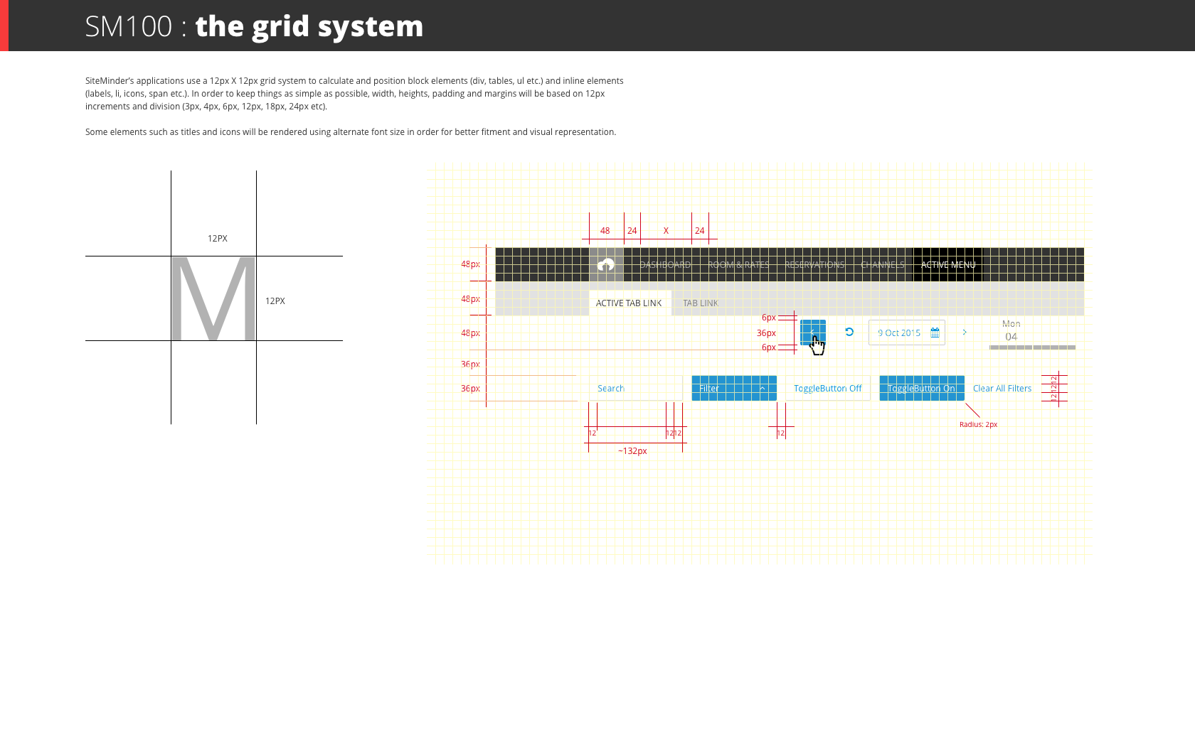
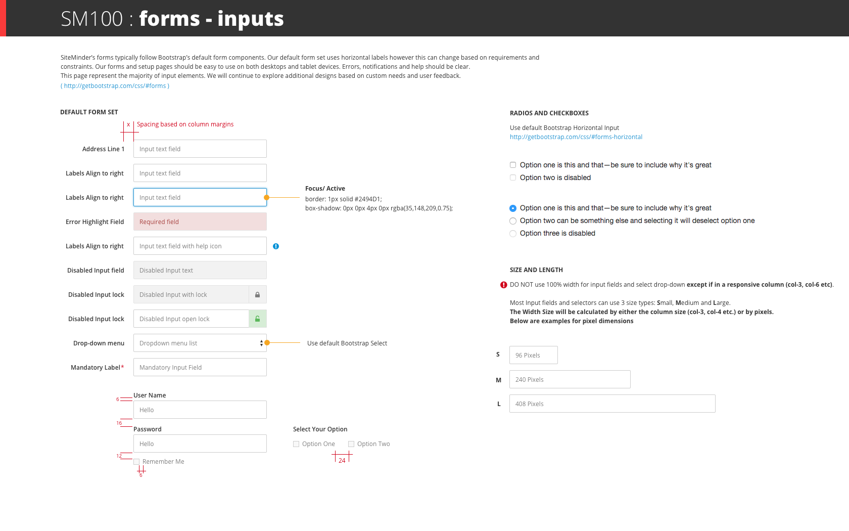
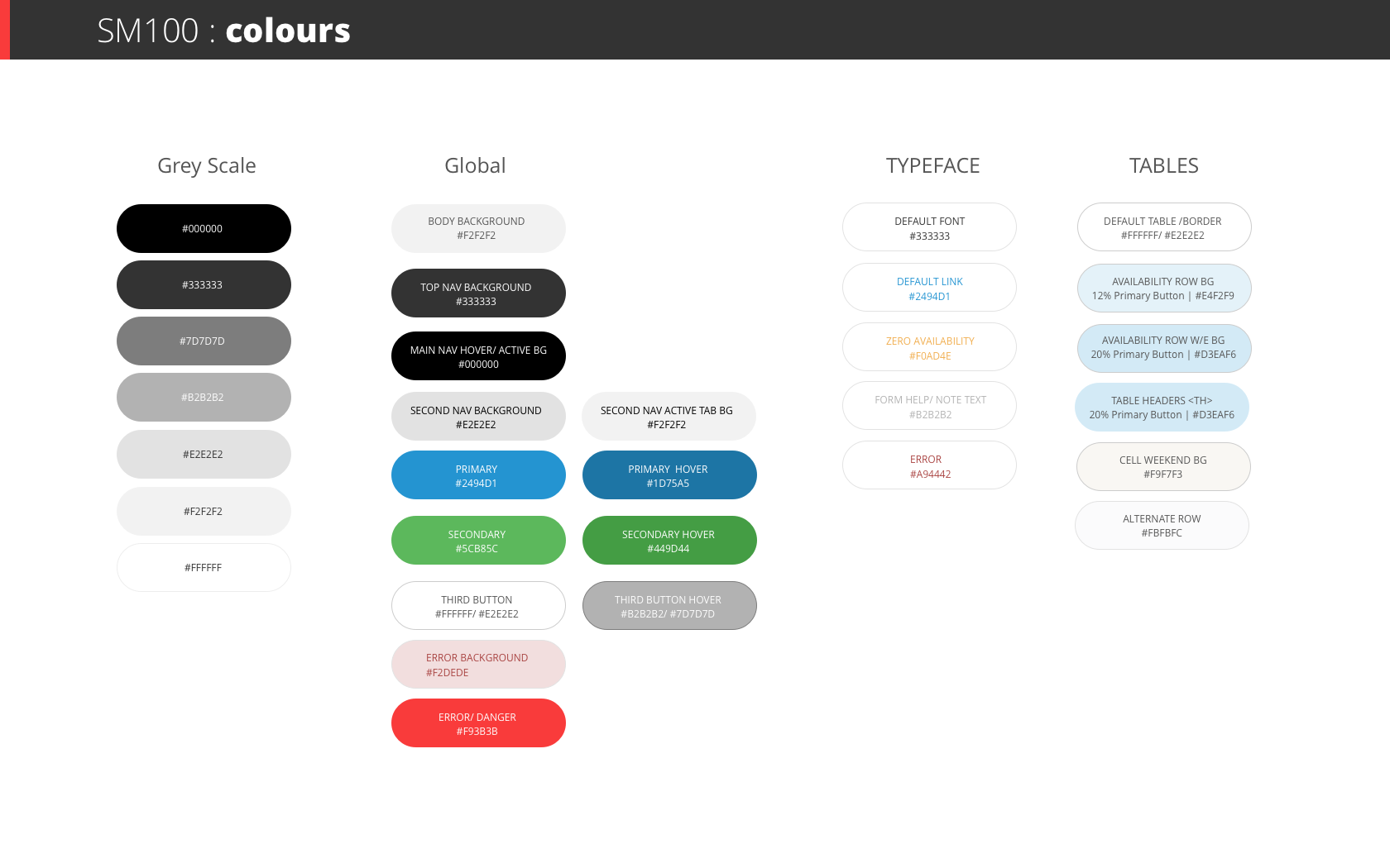
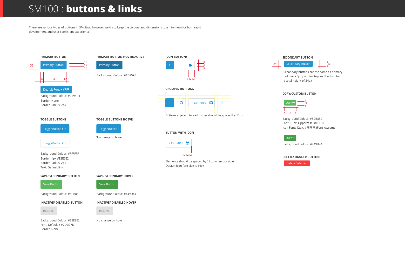
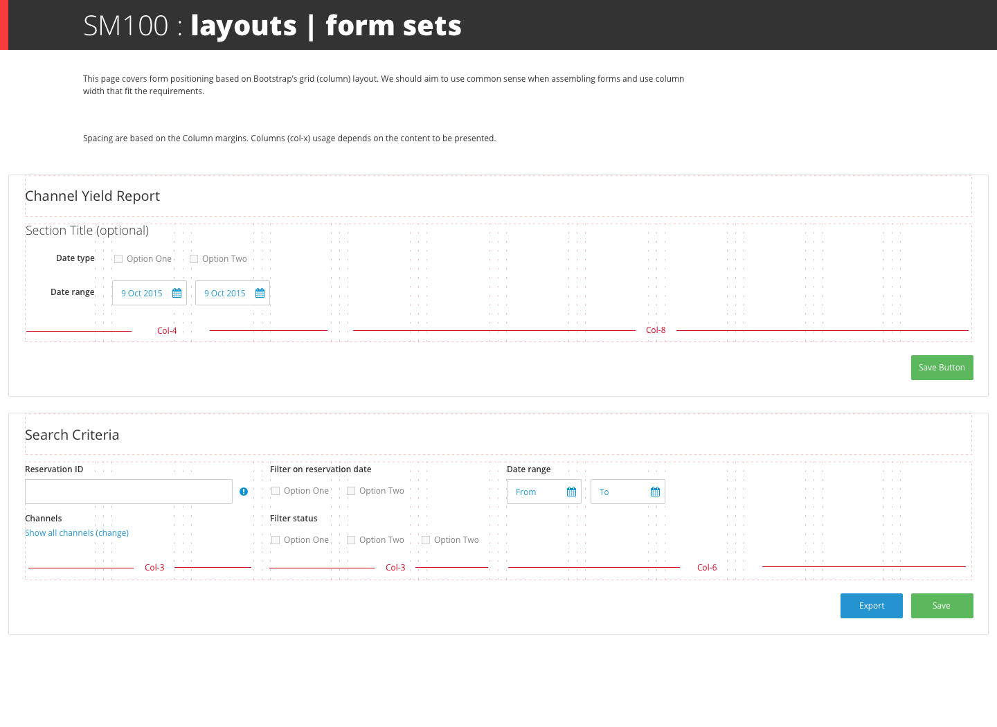
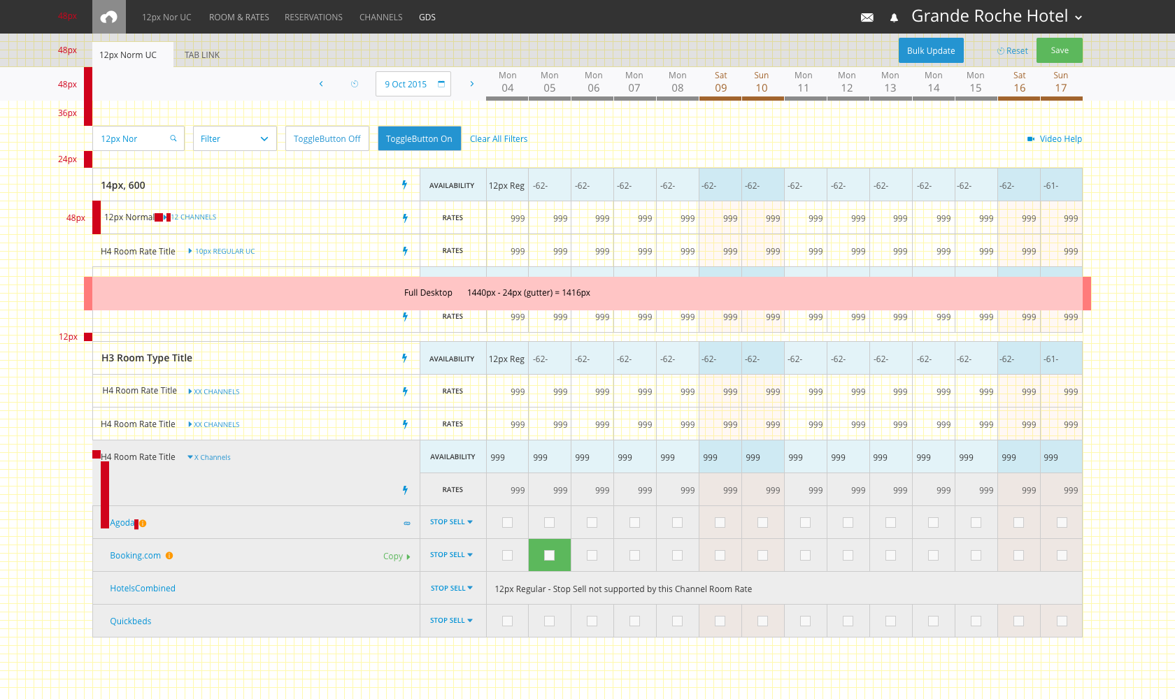
The company’s rapid growth and development of new products and features required us to develop a bespoke UI design system. Until then, we were using off-the-shelf and ‘bootstrap’ UI components. The design system was first developed for The Channel Manager especially the grid (table) and other supporting artefacts, layouts and pages. The UI system evolved and changed as we scaled up and started shifting to a platform model.
Production process
As a sole designer working alongside the CTO and system architect, we used very short sprint cycles mostly in the form of design>code, trial and iteration/ alterations. Hands-on direct-to-product and QA were necessary to launch fast. We iterated based on customer feedback and our experimentation.
The design method used was based on a primary grid size where all components were scaled proportionally. These were the very first days of mobile and responsive design with little knowledge and resources to learn from.
Outcome
The UI system we developed was a ‘scale-up’ system. We used the 80/20 rule and developed the most useable components first rather than spend months building an entire library.