Description
Kanopi’s original brand was developed primarily for the B2C market. With our move to a platform and embedded technology service provider, we had to adjust our brand to reflect that change without completely changing it. Kanopi’s brand was already well known; however, it lacked a symbol and colour palette that we could use across the various company experience touch points, including product UI.
Concept and solution
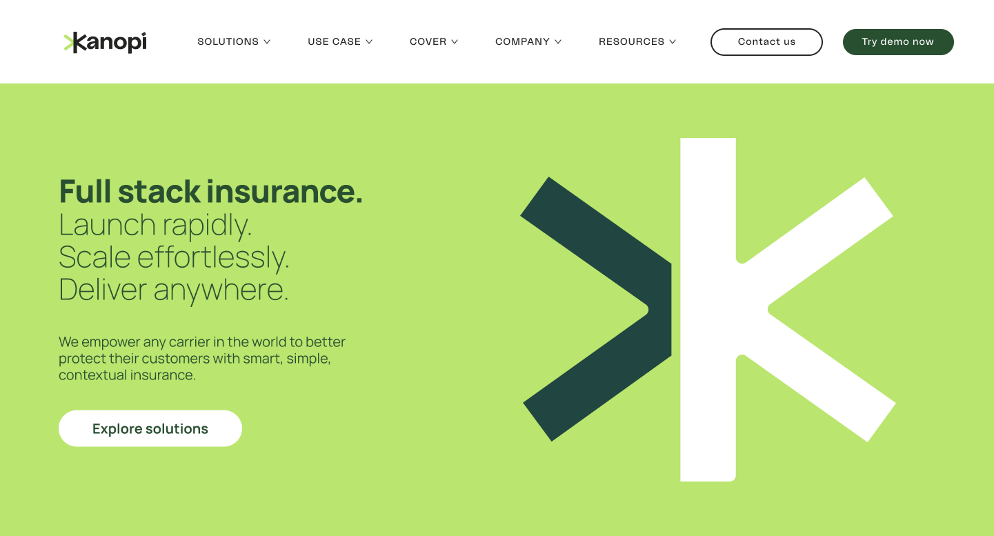
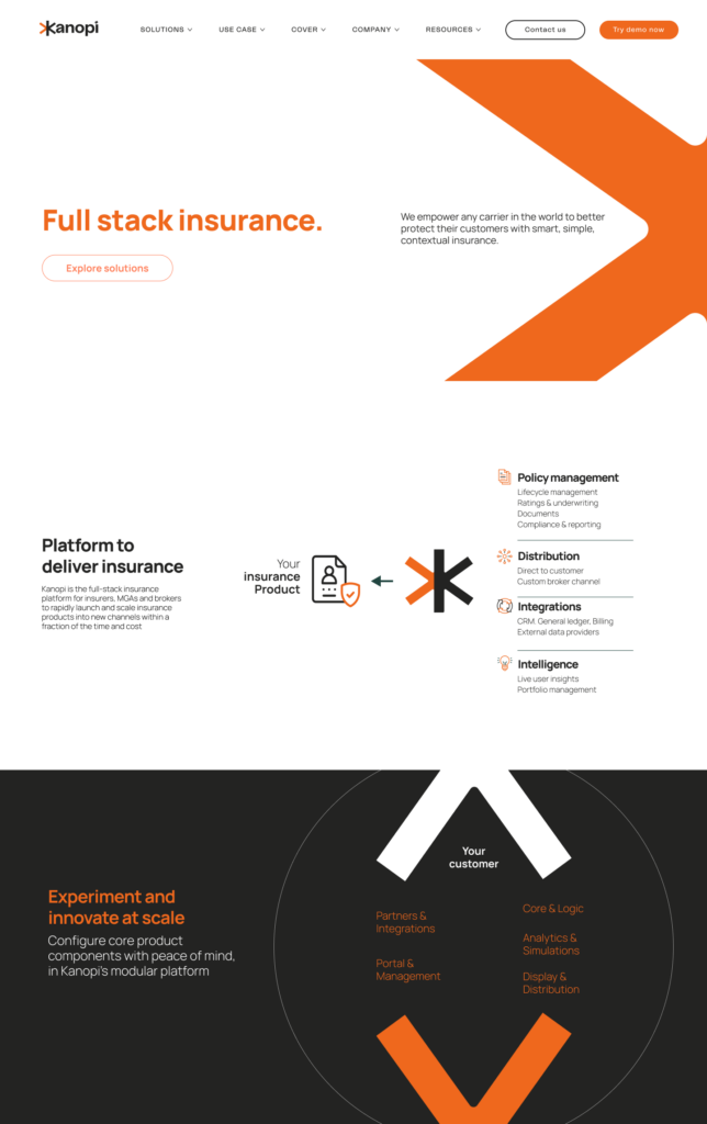
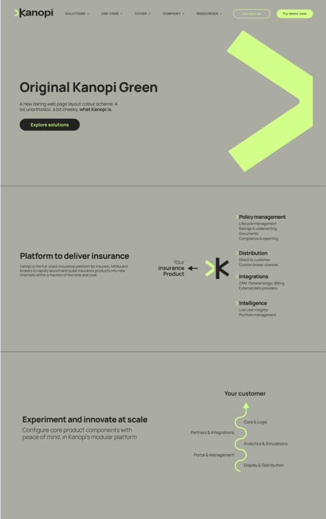
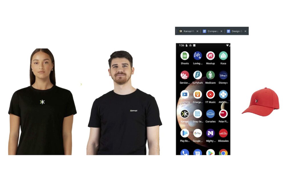
Working alongside a brand agency, we adjusted our brand identity to be still recognizable but with various changes to reflect our more company-focused market. This included creating a symbol that emphasises ‘forward movement’ and the closing/opening bracket symbol ‘>’, minor logo typeface updates, and an updated colour palette. We also added photos and photo treatment for future materials and developed a brand guideline.
The following are various examples and tests of mixed colours and content.