Description and problem statement
ADHD Australia is a leading NFP organisation founded in 2016 to help people with ADHD and their supporters. This includes government, schools, employees and other areas needing support and information.
The original brand worked well to a certain point. The issue was that it was primarily designed for print with colour palettes and typefaces that were not suitable for digital responsive content production. While it was manageable, the old brand needed some updates and changes to reflect the shift to “digital first”, responsive design and focus on accessibility (especially for our specific audience)
Design Process
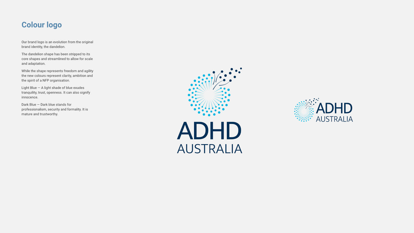
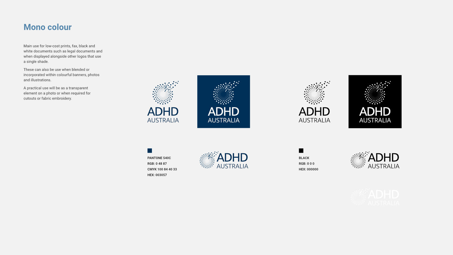
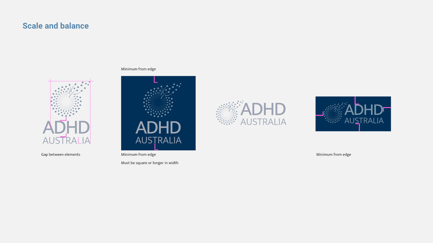
- Develop new logos as well as refresh the existing logo
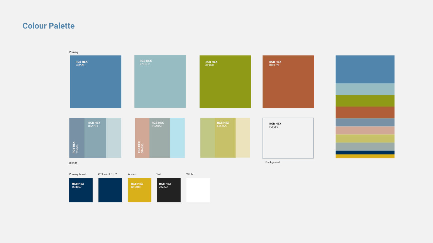
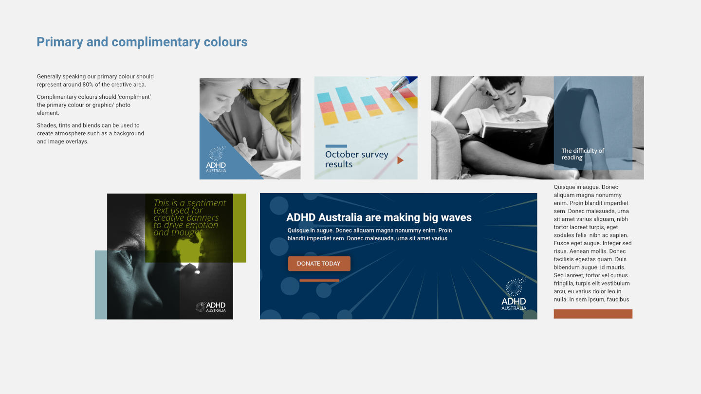
- Develop a new colour palette suitable for people with ADHD (how colours affect content consumption by people with ADHD)
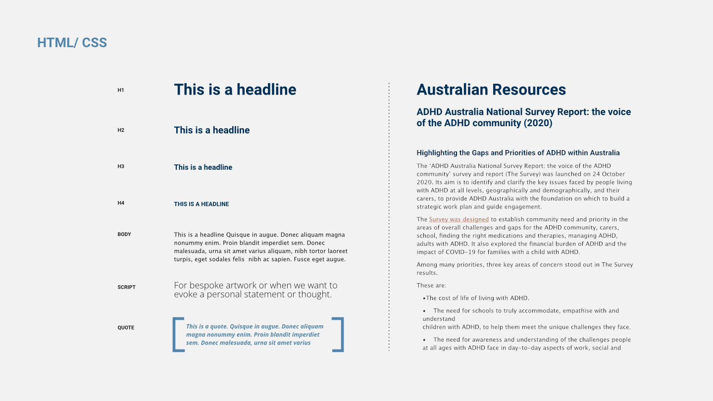
- Typography treatment for website and digital assets
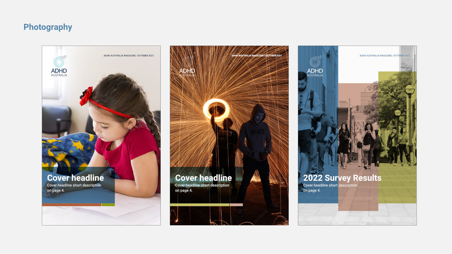
- Layouts and space (Best practices to create engaging layouts for people with ADHD)
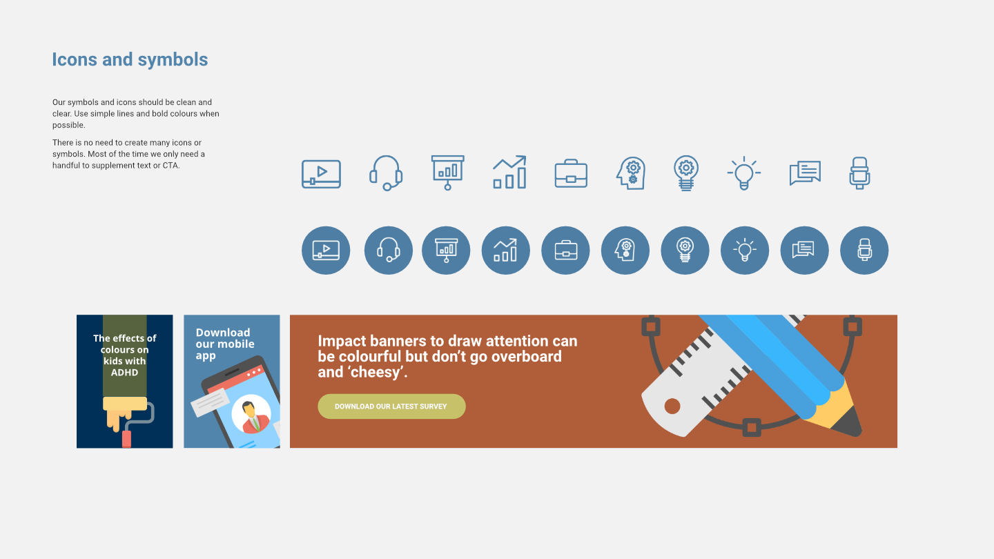
- We are developing an easy content production process and guidelines suitable for non-designers within a volunteering capacity.
Outcome
After a few research and review sessions the organisation decided to refresh our established logo while adopting all the new brand identity guidelines. The new brand guidelines, processes and kit were easy to share, adapt and train new staff members, primarily non-designers such as website and social media content producers, writers, marketers and executives.
The guidelines and kit are now part of our Canva brand kit and various other external tools making our brand more consistent and approachable. We also monitor and update our brand guidelines based on external and internal feedback.
